Highlight Arts
Brand Identity
Project Overview
The London-based Highlight Arts (formerly Reel Festivals) is an international arts collective who organize events, festivals and educational workshops.Through international collaborations with artists, poets & writers, filmmakers, musicians and visual artists Highlight Arts ‘challenges’, ‘interrogates’ and ‘celebrates’ – enabling deeper solidarity with communities and individuals in times of conflict.
Highlight Arts planned to relaunch in October 2014 as a new member led organization. With that they were in need of a new identity system and logo design that encapsulated their beliefs and core values, as well as reflected their international work which includes projects working with artists from Iraq and Arctic nations to Jamaica and India.
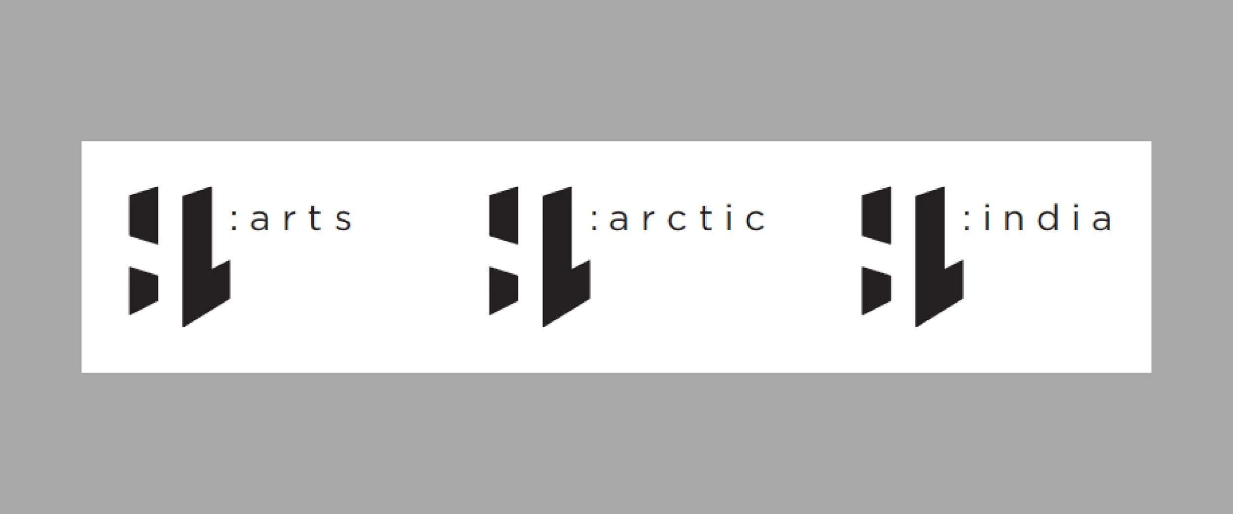
goodgood’s aim was to create an iconic form which could represent the ability to share perspective and dimensionality, while conveying solidarity and strength. The logotype was composed by unifying the negative form (“H”) and positive (“L”). This design gives the viewer opportunity to discover/create the form in their mind’s eye (“H”), without the form actually existing. It may sound a bit contrived, but we believe that there is a connection made with the viewer during this process!
Highlight’s logo was designed upon principles of gestalt theory (the “unified whole”). Where an icon can consist of separate forms (in this case 3), gestalt theory has shown that human visual perception can combine disparate forms into one unified whole (eg. World Wildlife Foundation, FedEx arrow, the work of Noma Bar).
Qualities: perspective, dimensionality, literally “highlight”, reveal, complex, challenging, solidarity, inspiring, strength.
LOCATION: United KingdomSERVICES: Identity Design


